Sheltered Spring
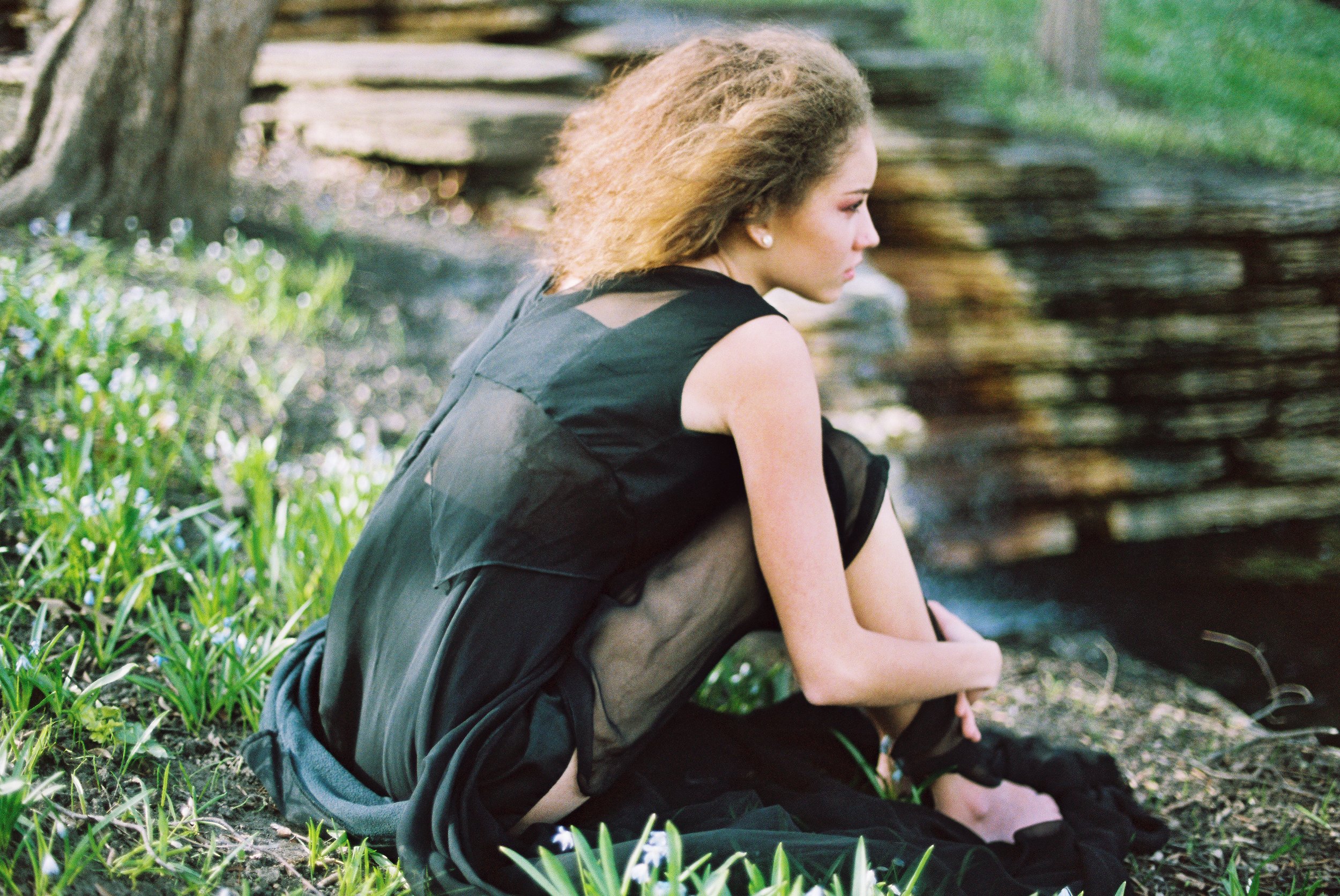
With blooming plants and growing grass,
one girl wanders.
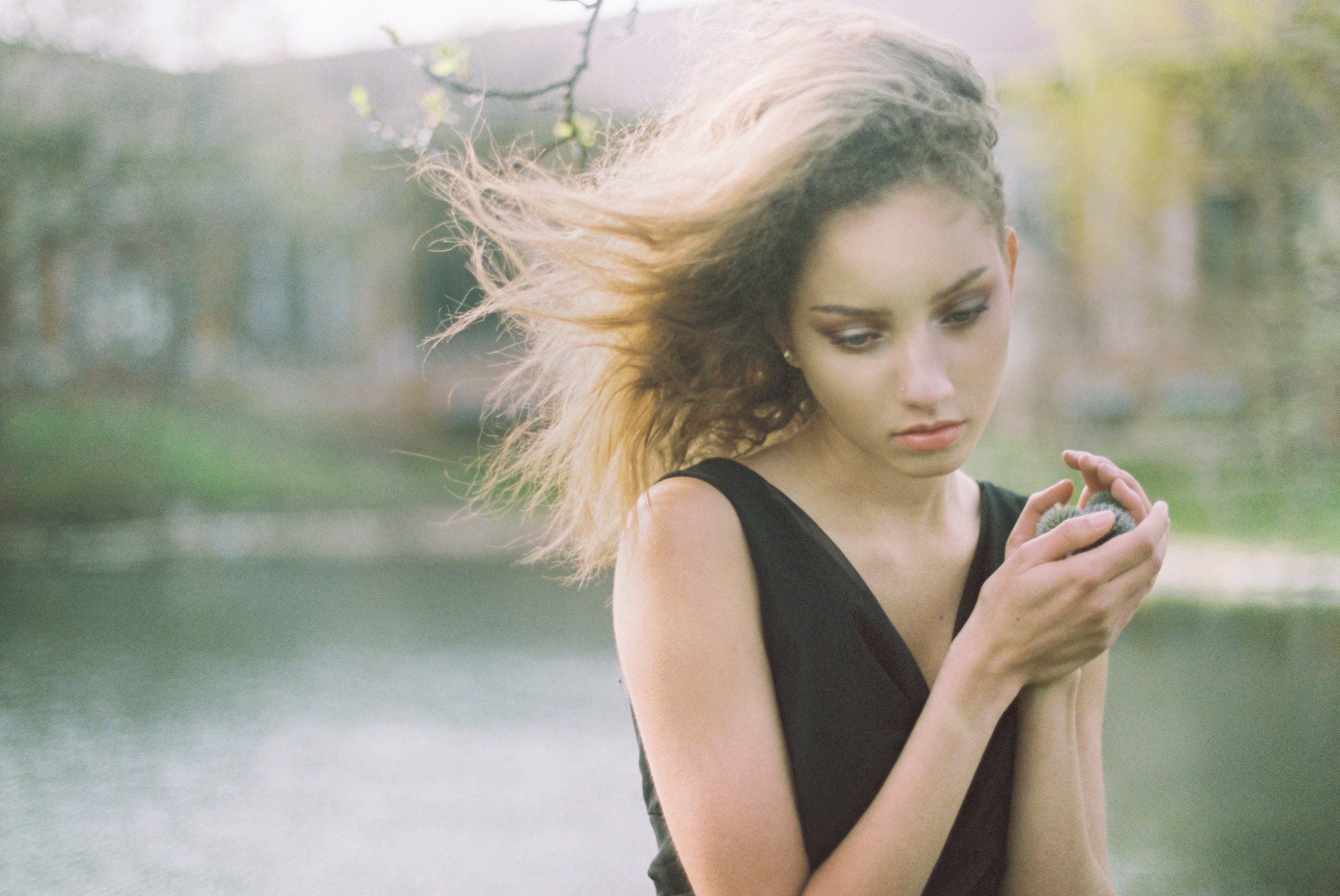
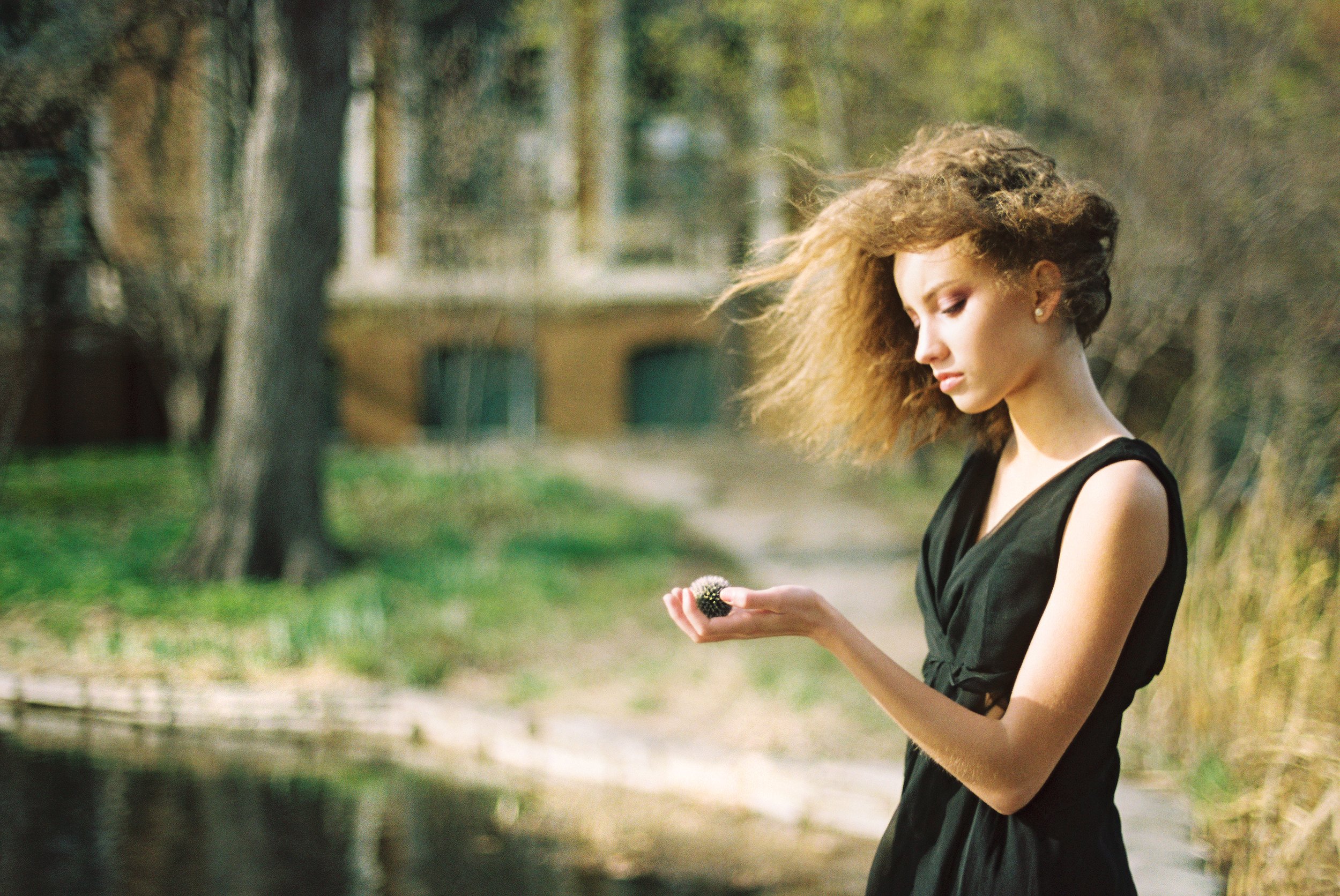
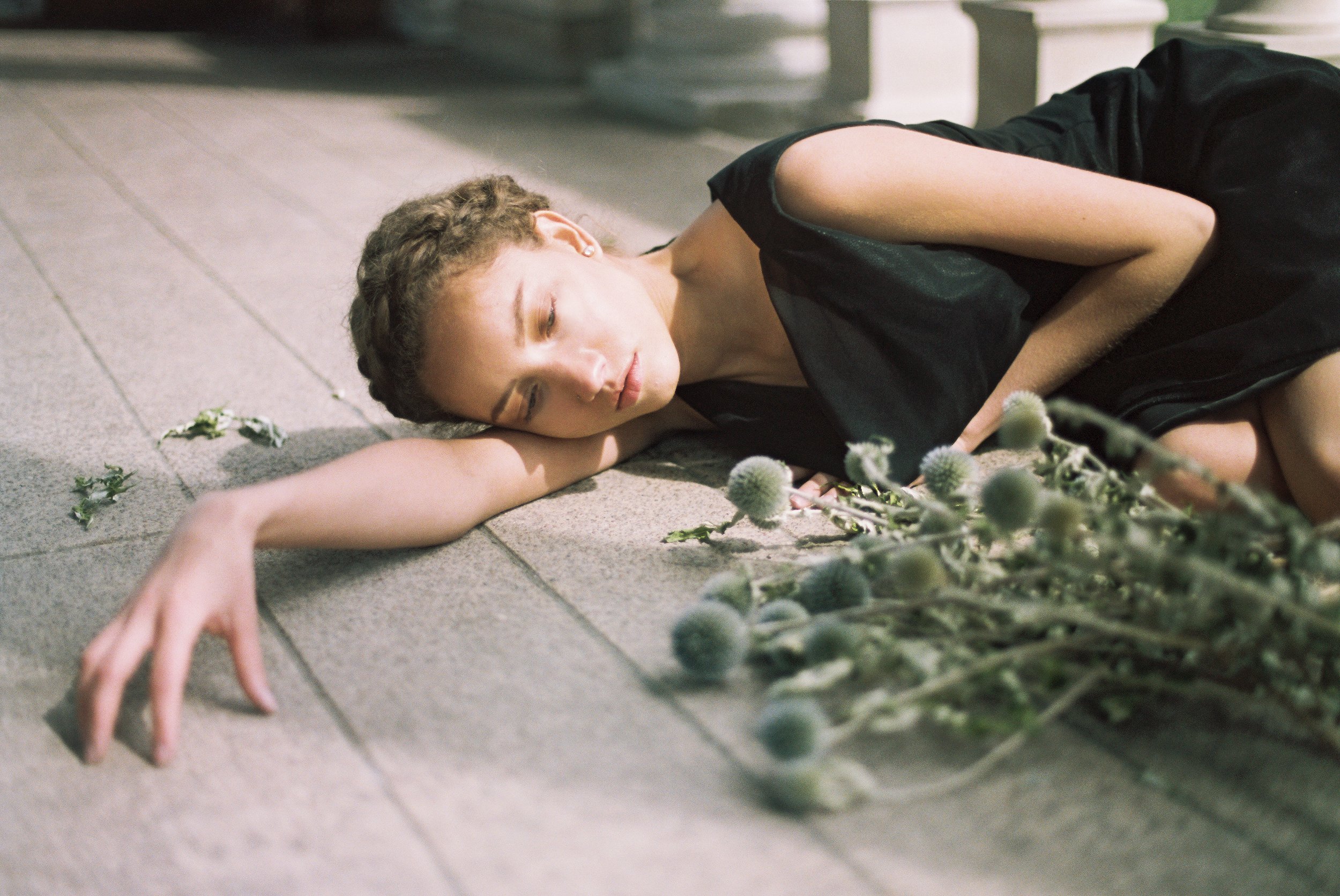
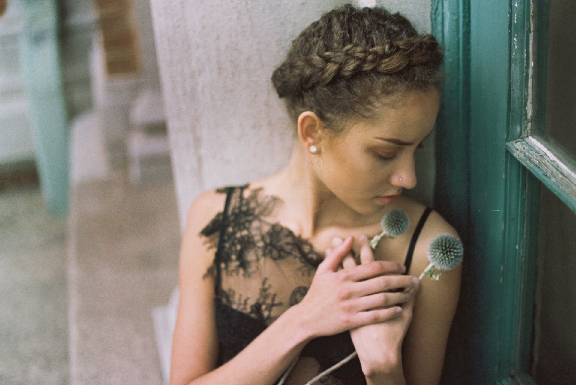
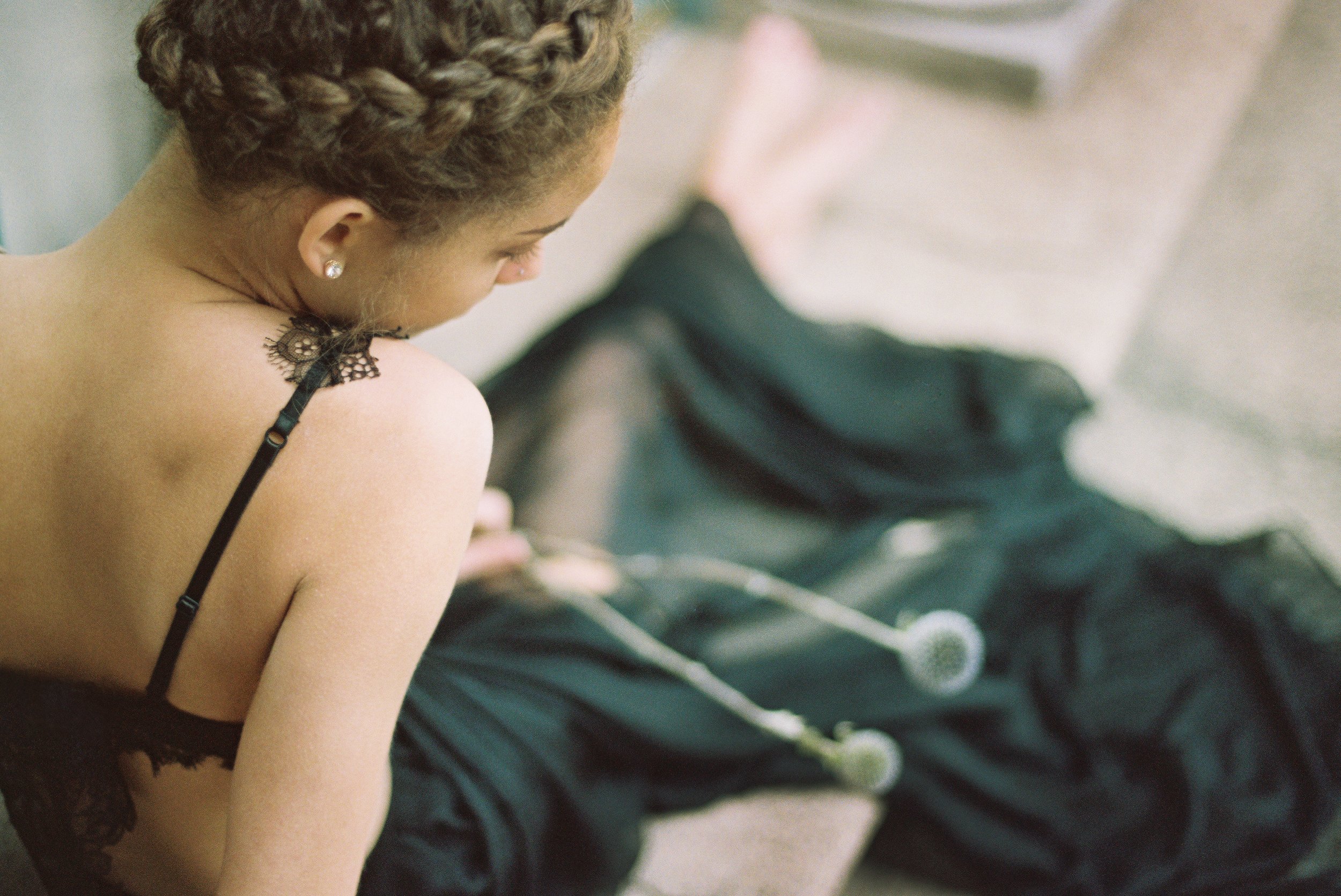
In her hands, she holds small thistles.
Dried with age, she keeps them close, shielding them from sunlight.
Like jewels, they rest – preciously hidden away.
When alive, she had quickly gathered them –
but then they began to dry.
And as they dried, she clasped even tighter.
Though spring now grows around her,
the thistles still remain.
-
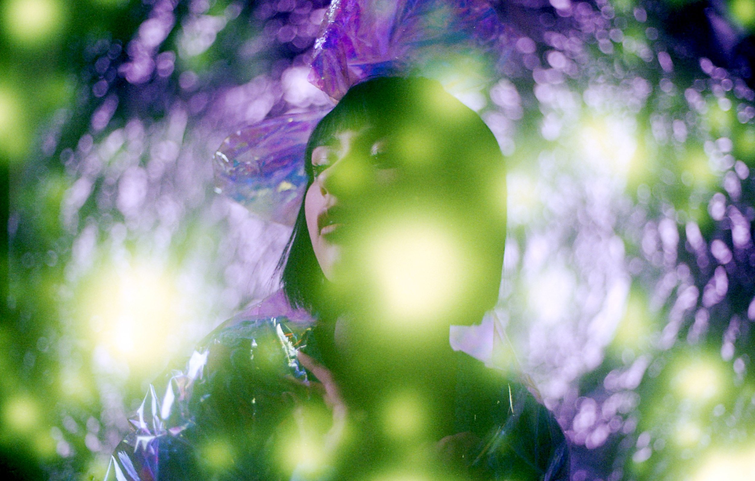
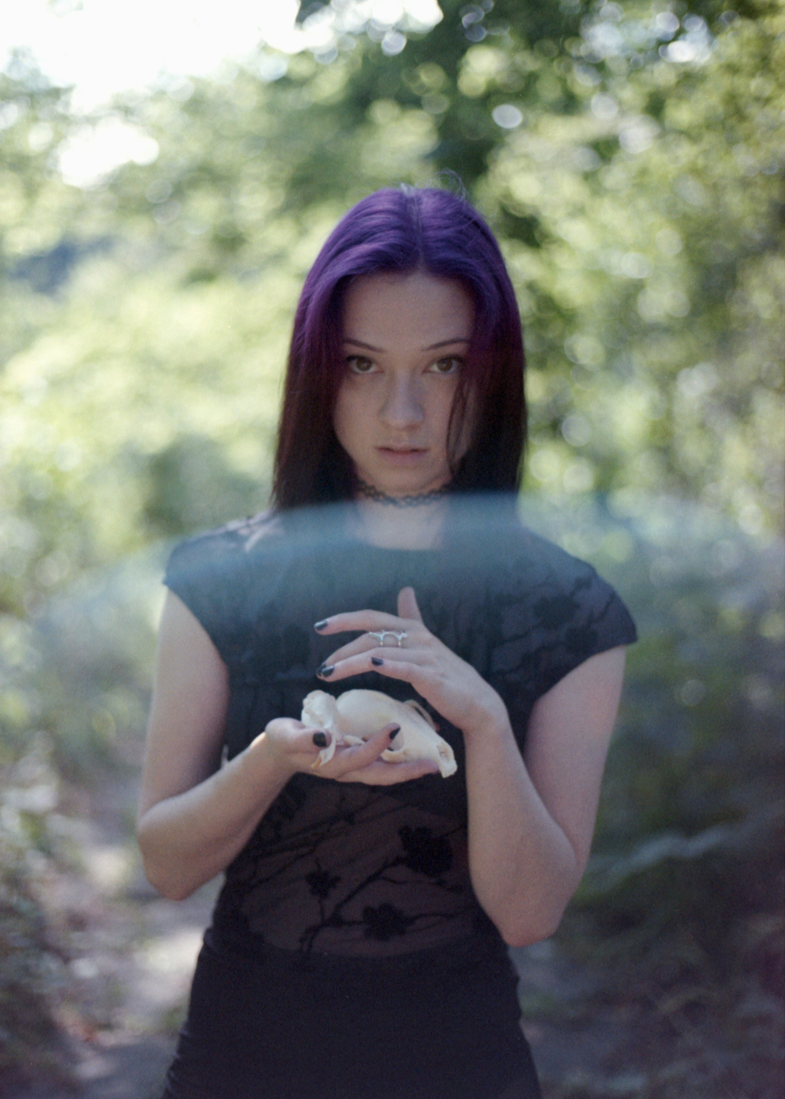
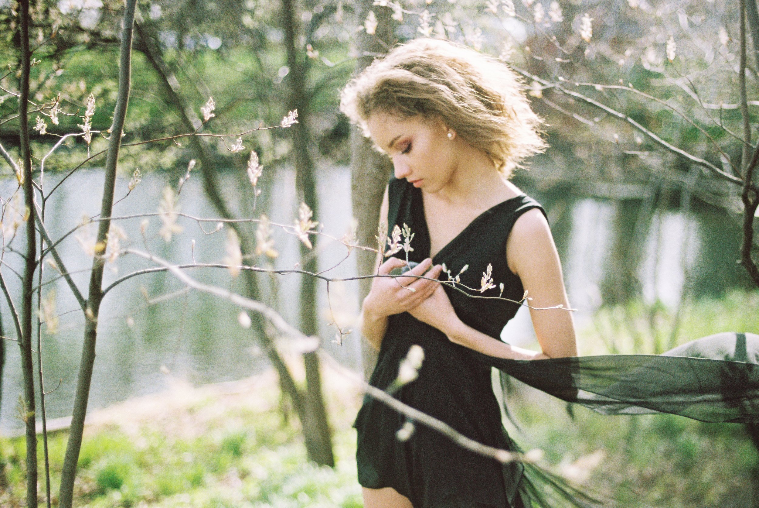
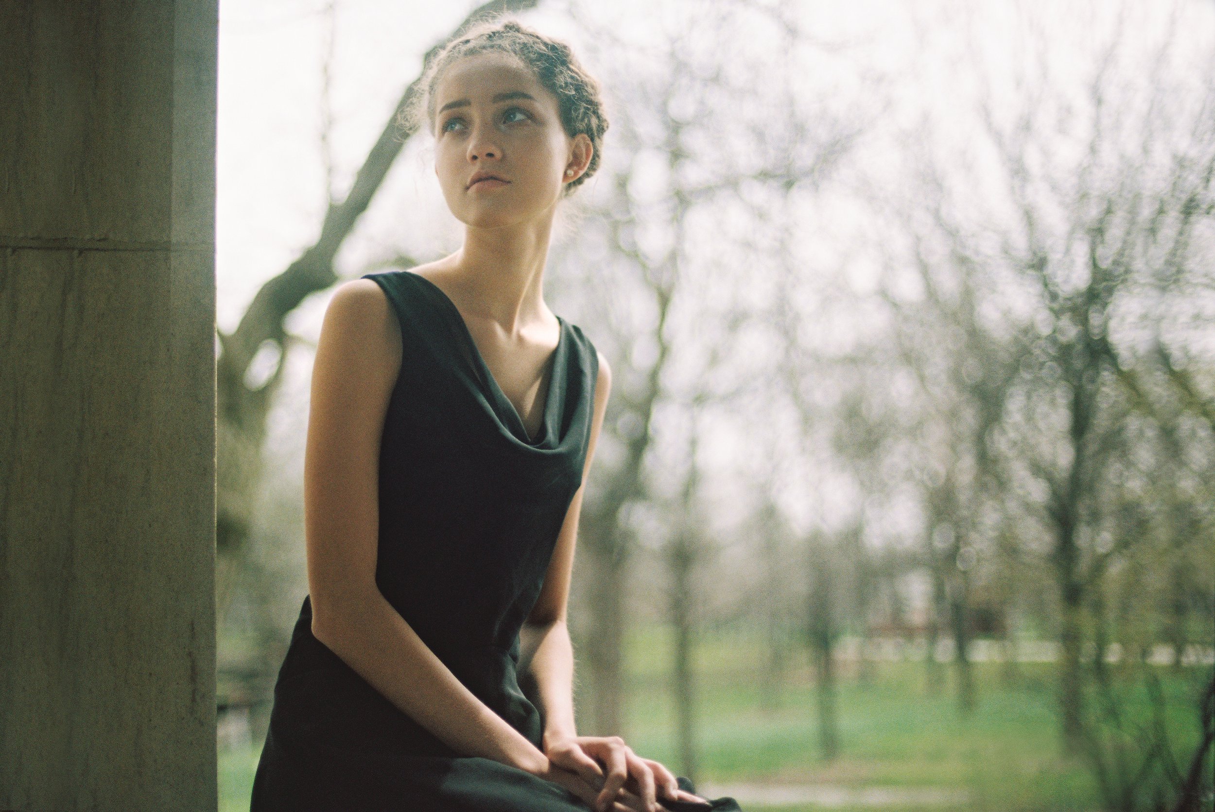
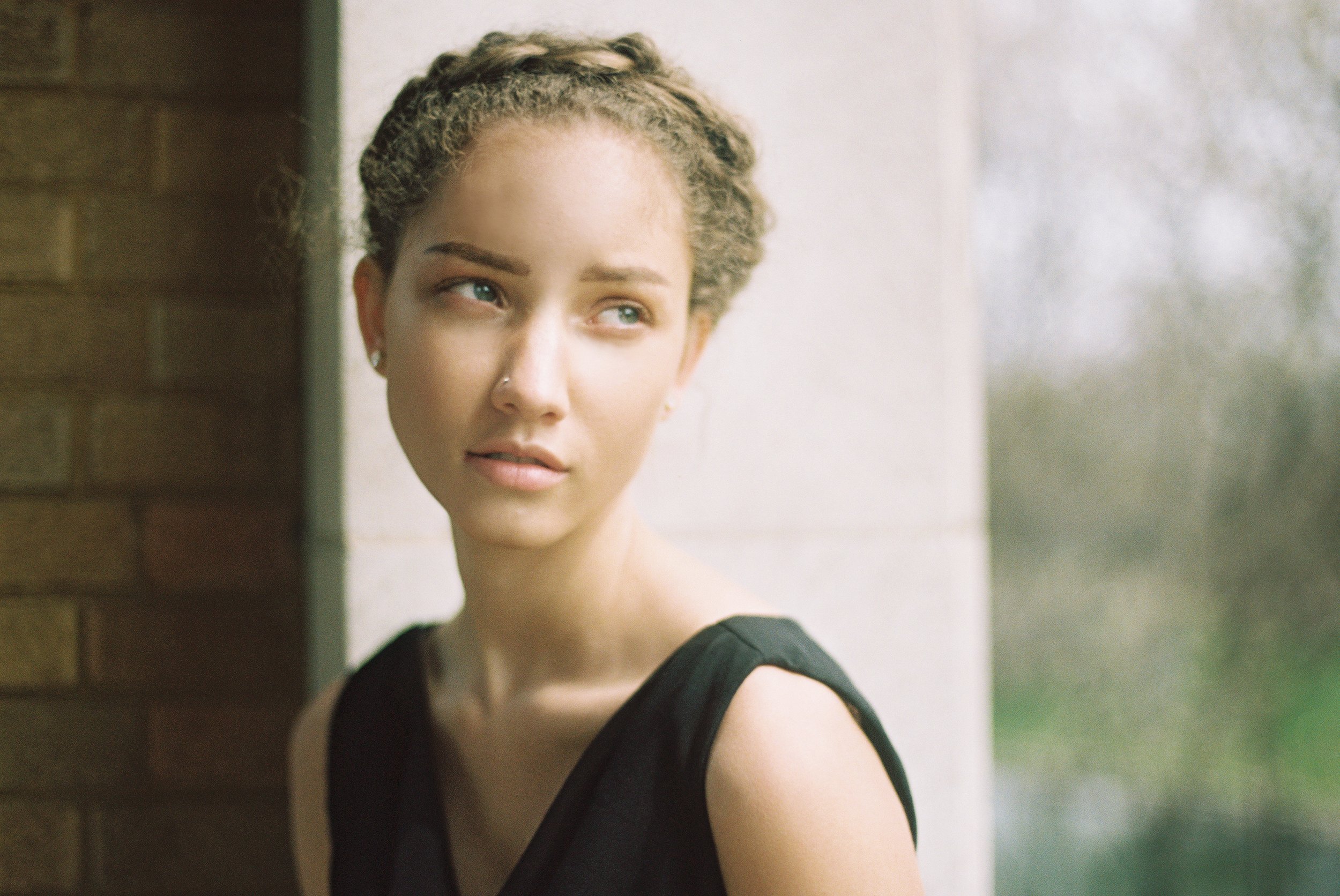
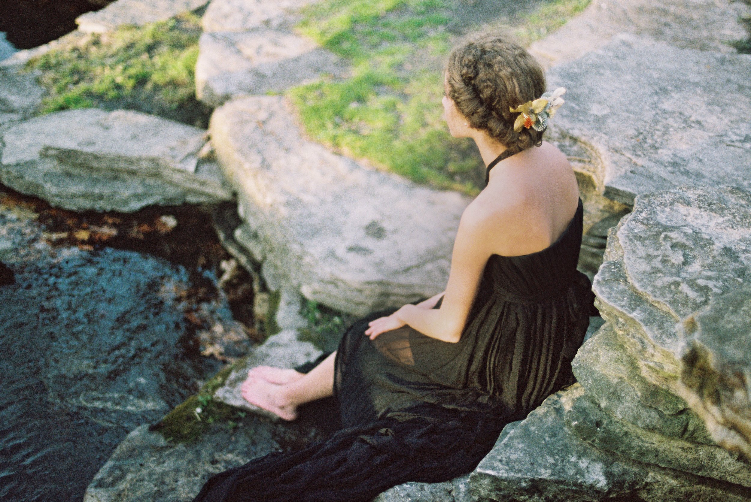
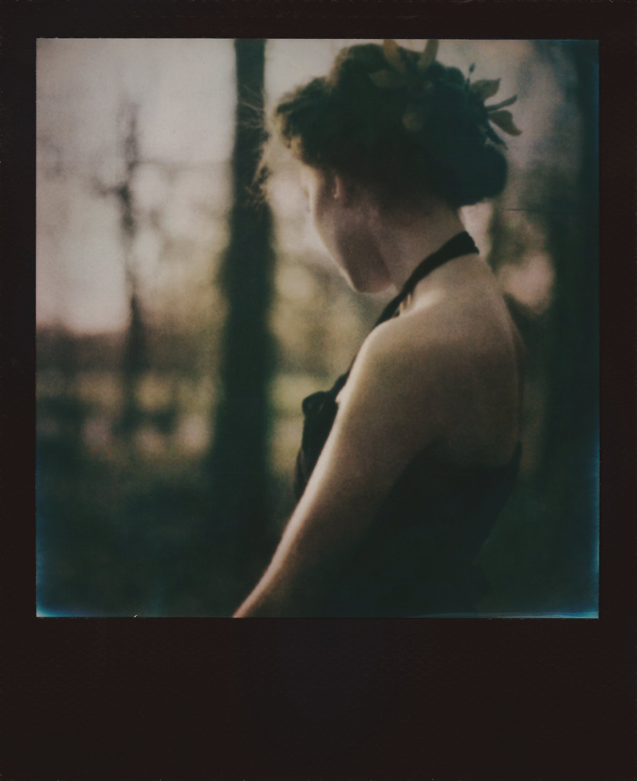
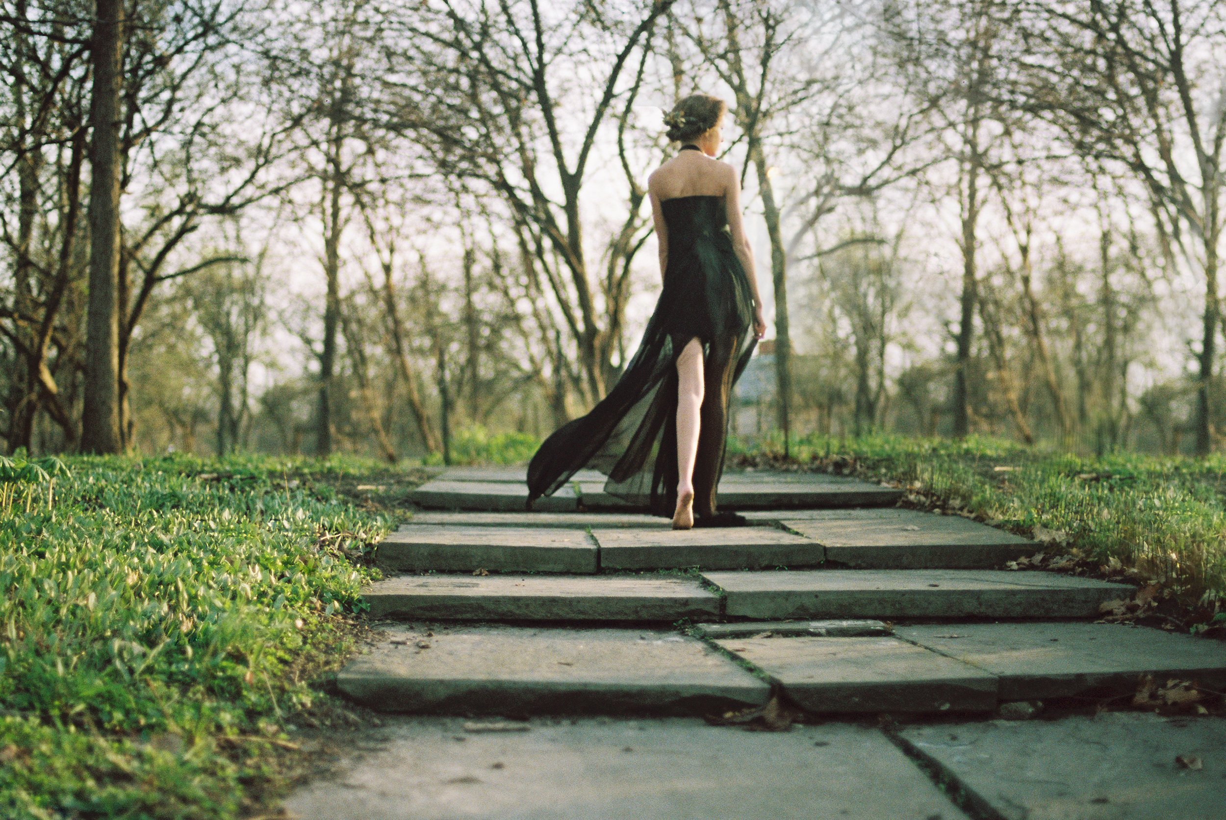
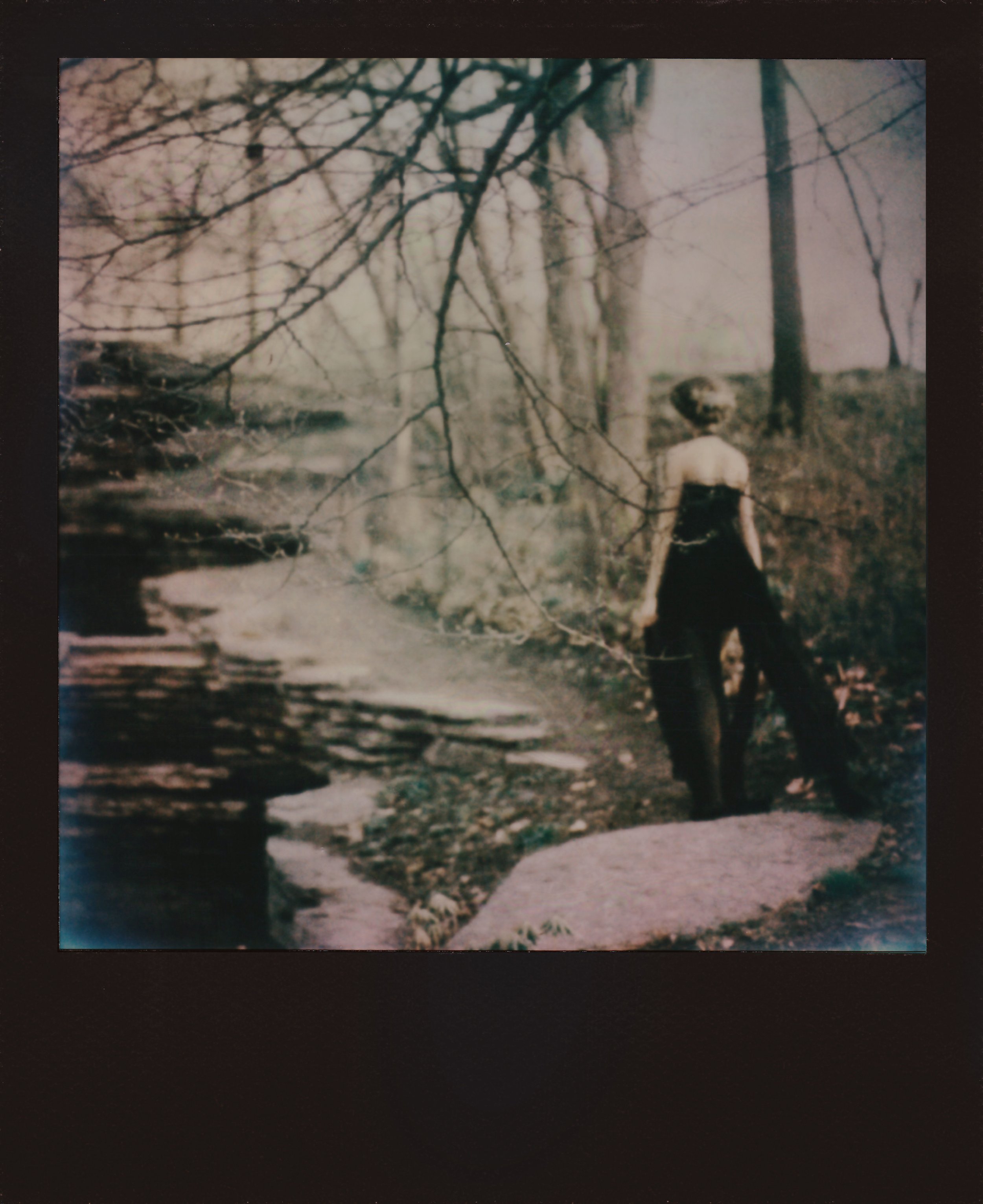
This one is built entirely around contrast. Spring is the obvious side of it — new growth, things blooming, that sense of everything starting over. My model is the other side of that. She's dressed in dark, noir-leaning chiffon and lace, holding onto dried thistles that have gone from purple to brown, and she won't put them down.
The thistles are the real symbol here. She picked them when they were still alive, and instead of letting them go once they dried out, she started holding them tighter. That's the whole idea behind the series — habits, obsessions, defense mechanisms, anything you keep clinging to long after it's stopped actually helping you. Meanwhile the world around her keeps moving forward and blooming, whether she participates in it or not.
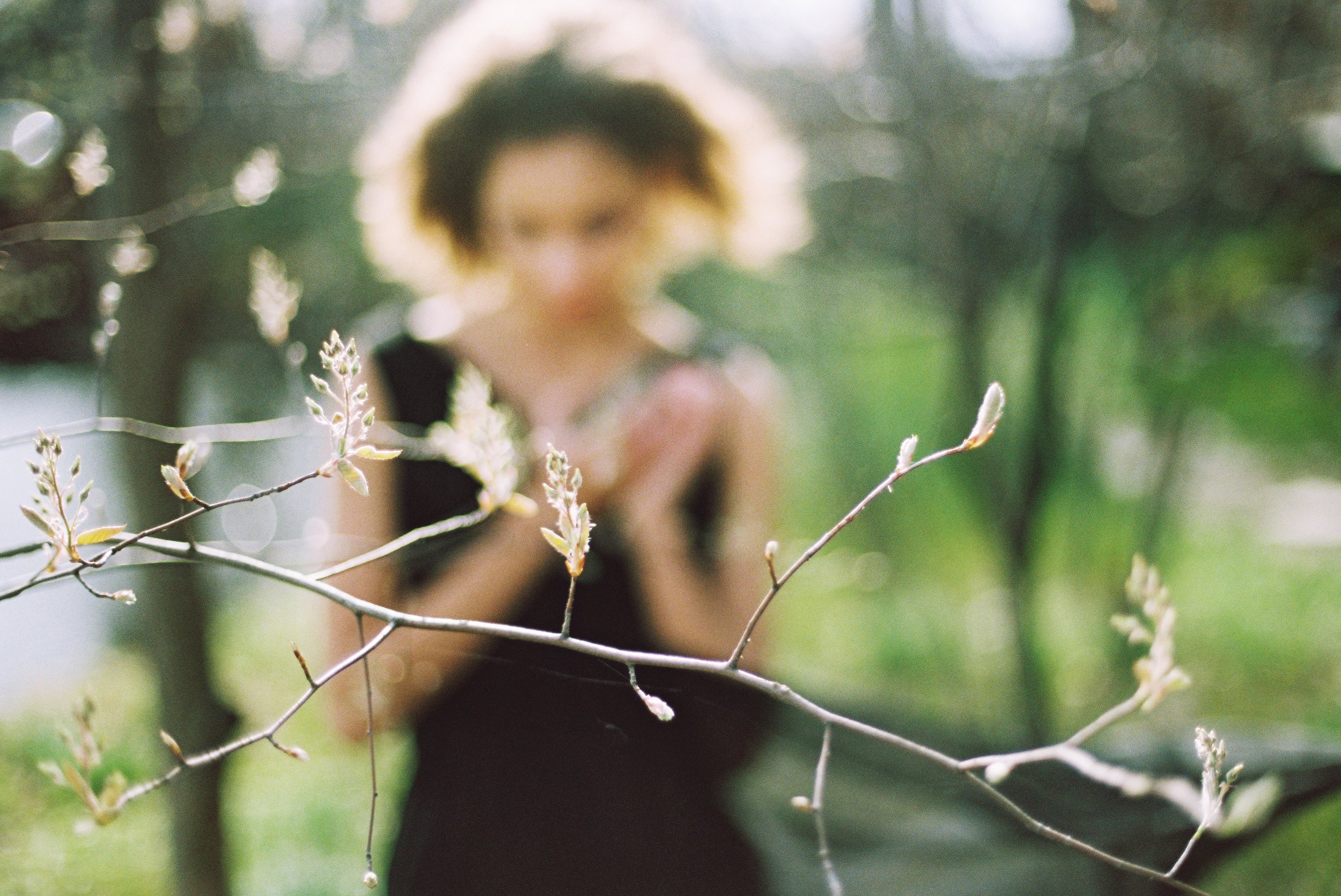
I wanted the contrast to hit visually before it hit conceptually — dark clothes against bright spring color, dead thistles against fresh flowers, someone standing still while everything around her grows. It's less about her being wrong for holding on, and more about how normal it is to do that, even when it isolates you.
-
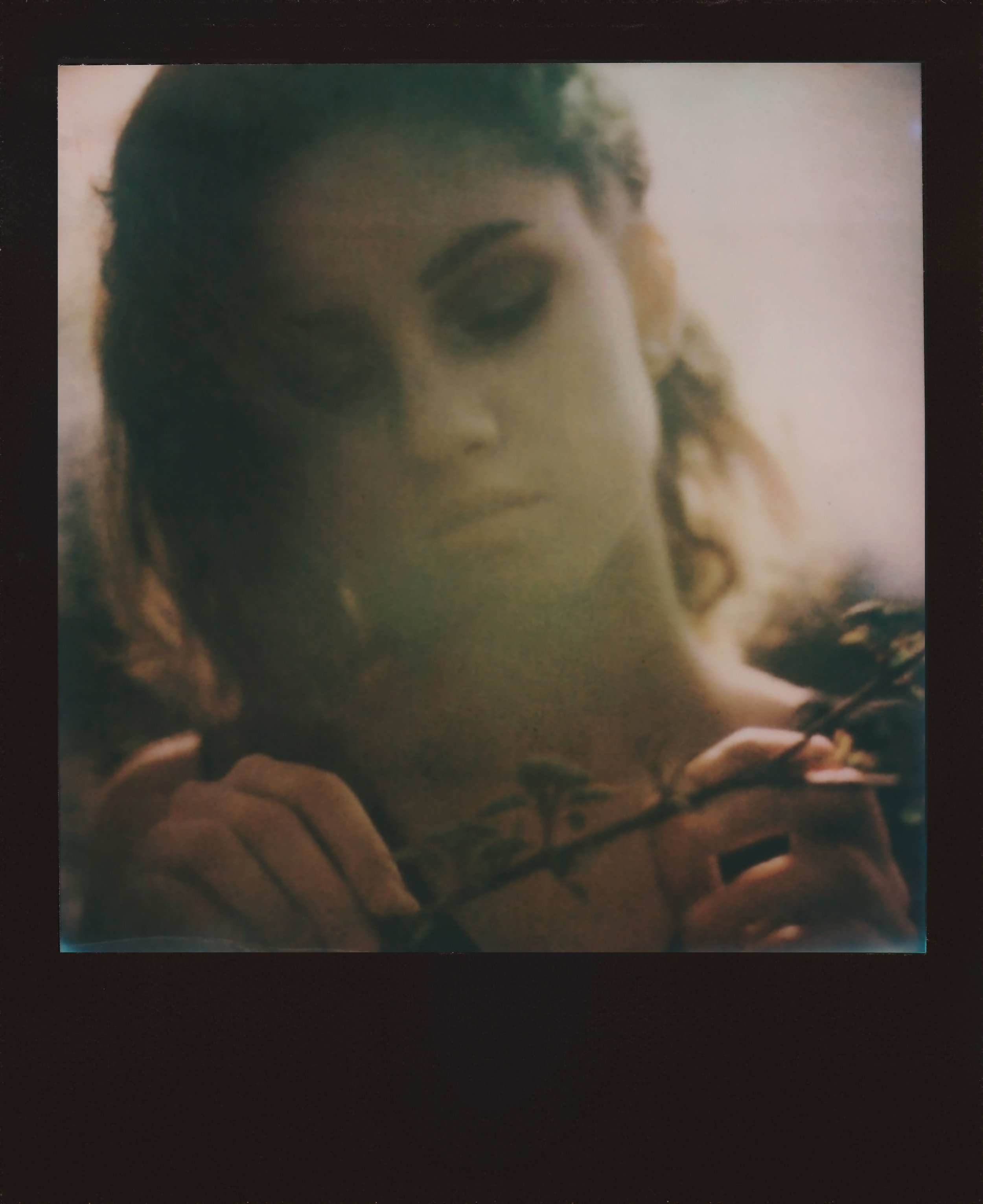
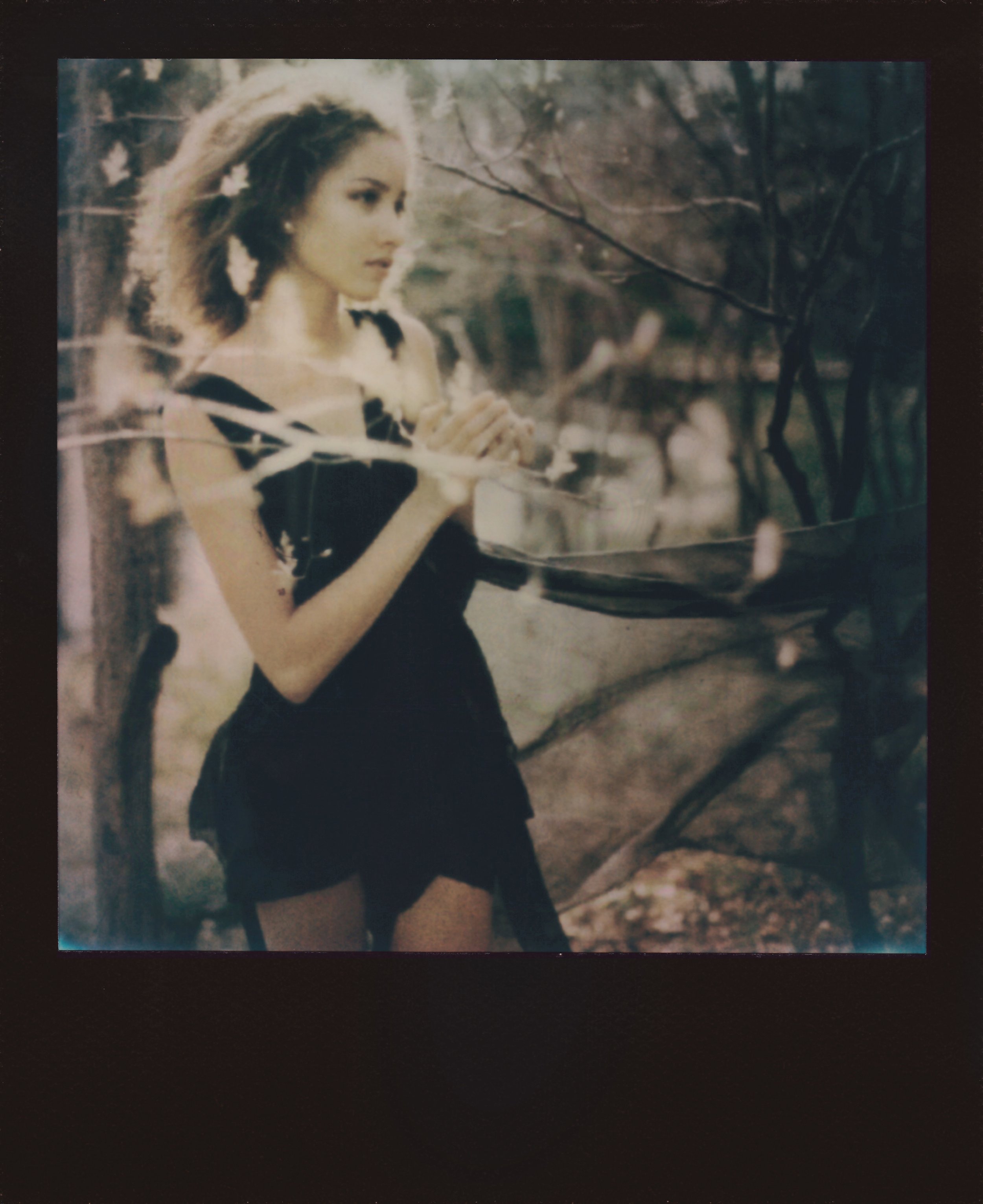
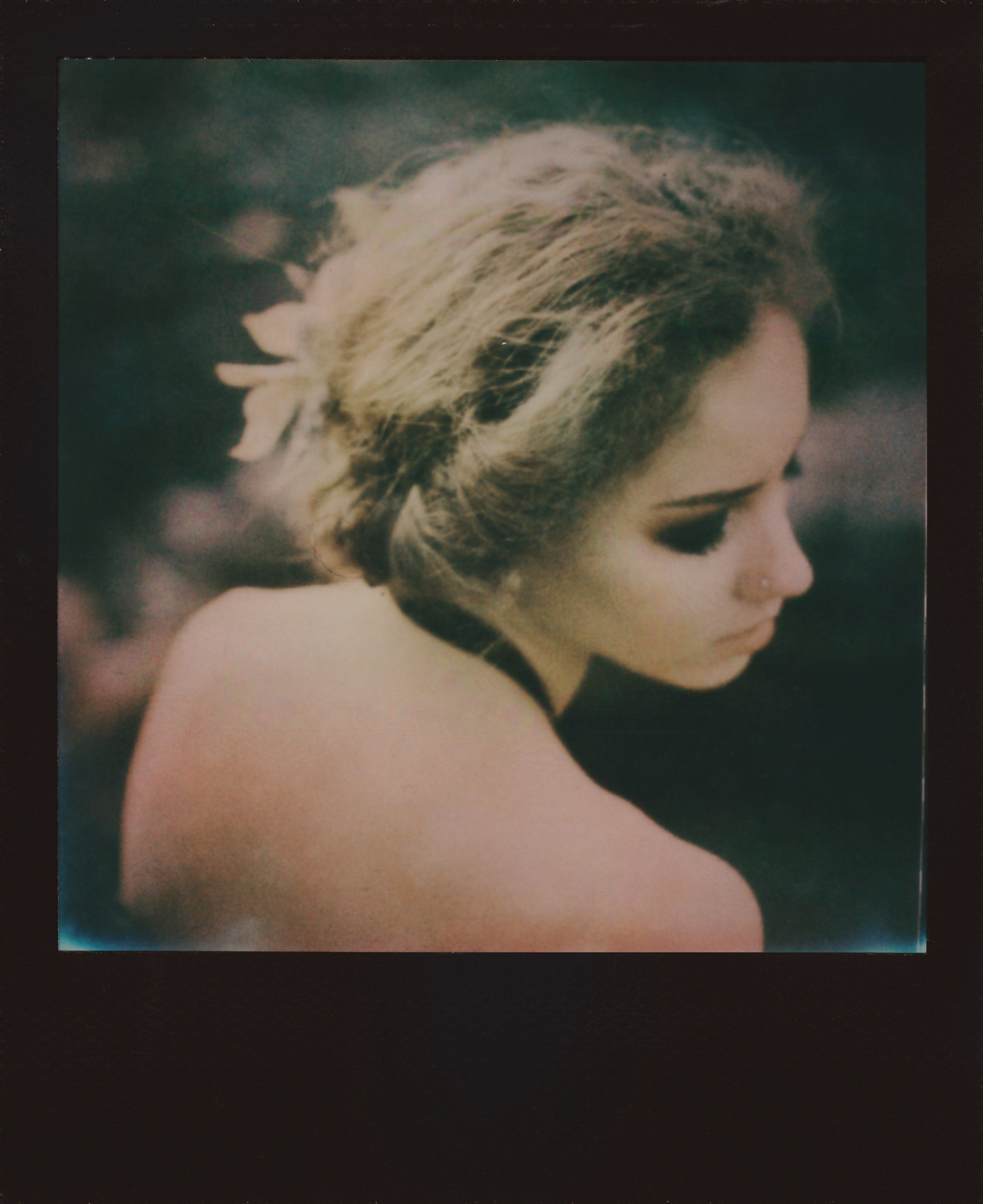
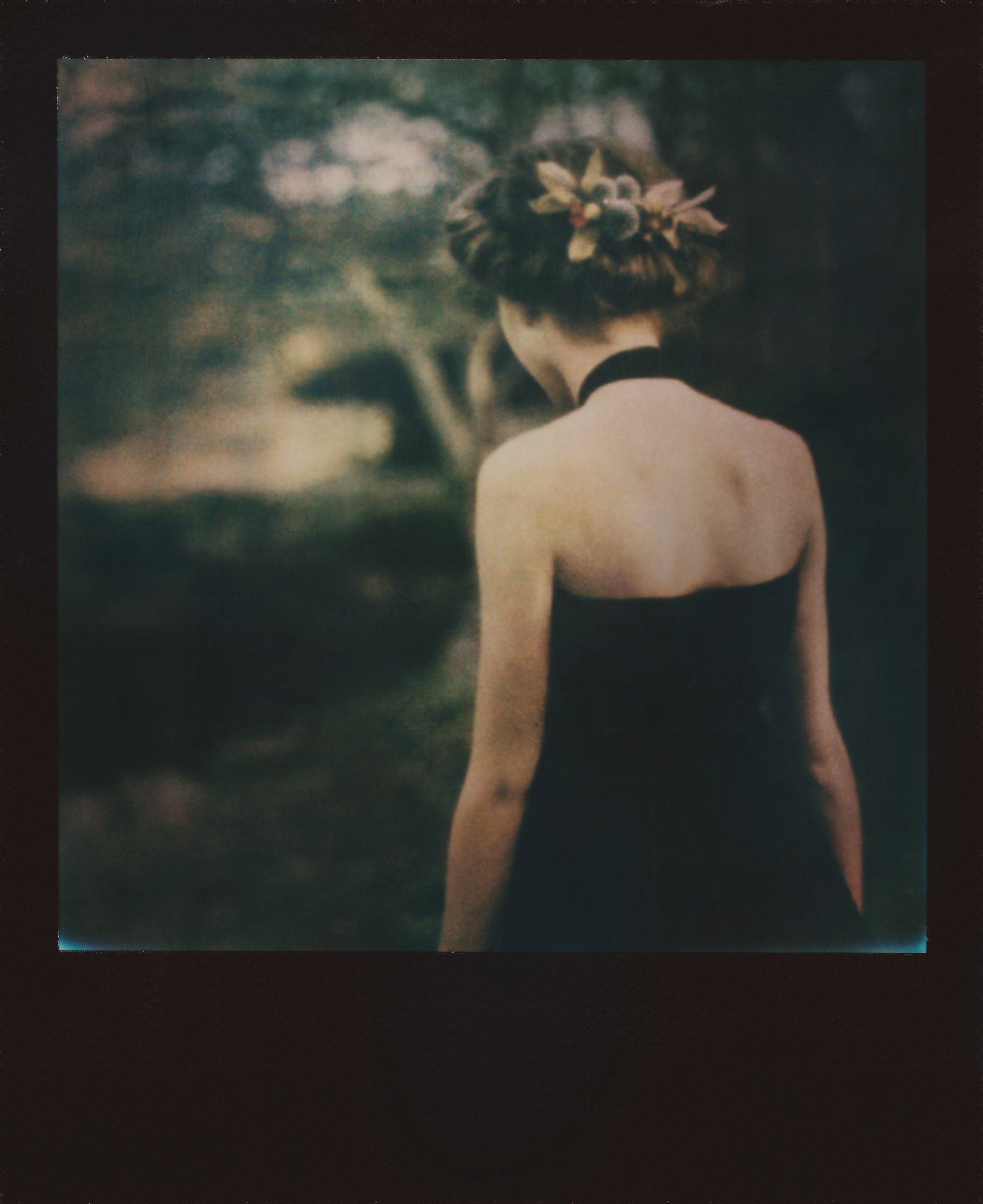
I shot this on Kodak Gold 200 and Polaroid 600. Gold 200 did the heavier lifting for the environmental shots — it handled the contrast between her dark clothing and the spring background well, and kept the color rendering consistent across the whole shoot. Polaroid 600 came in for closer, more intimate moments, where I wanted something a little rougher and less controlled.
The dried thistles held their shape well throughout the shoot, which mattered since they were both a prop and the entire symbolic center of the series. Staging leaned into contrast on purpose — dark styling placed directly against the brightest, most alive parts of the environment, so the tension reads immediately without needing much explanation.
-
Model | Cortazia Harrington
HMUA | Andie Peirce
Stylist | Krystell Barraza -
Thistle Magazine (2015)
Whim Magazine (2015)
Behance Feature